










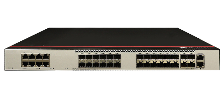


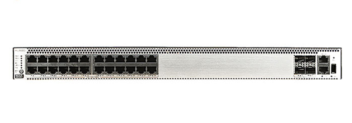


Did you know Cisco.com gets more than 355.5M visits a year? One out of every 10 visits is from a mobile device and mobile usage is growing. Much of the Cisco website is mobile-friendly, with the new Cisco.com Home page, Product pages, revised Support Home Page, and over 7,800 Model pages. Now we are turning our attention to 200K+standalone, single HTML content pages.
A new mobile-friendly (responsive) template is being applied to all content pages on Cisco.com.
Not only does the new mobile-friendly format automatically adjust to fit any screen size, it also includes some new design features:
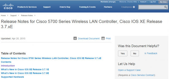
Let us know how we are doing. Add a comment or click on the feedback link on any document, and we'll get back with you.
-By Joann Hartman, Christopher Bey, and Vipul Ashta
 Горячие метки:
Веб-сайт
responsive design
mobile browser