











The first wearable from Motorola that I tried was the MOTOACTV back in 2012 and that device served me well for a couple of years. I also spent time with the Moto 360 in 2014 and found it to be one of the better Android Wear devices.
Last month I received an email from Motorola advertising the new Moto Watch 100 and for just$100 I figured I would order one to try out. I missed the news that eBuyNow is a company that licenses the Motorola branding and this watch comes from that company and is not a direct Motorola product. After 10 days of frustration, I've initiated a return since there are just too many issues despite the two firmware updates I've already installed.
Key functions of wearables should be accurate data collection, reliable syncing to your smartphone app, the ability to view trends and run reports so you can track your progress, and flawless usage that doesn't consume your time or cause frustration. Unfortunately, the Moto Watch 100 only does fine in a couple of these functions and even then the data does not seem to be of the best quality.
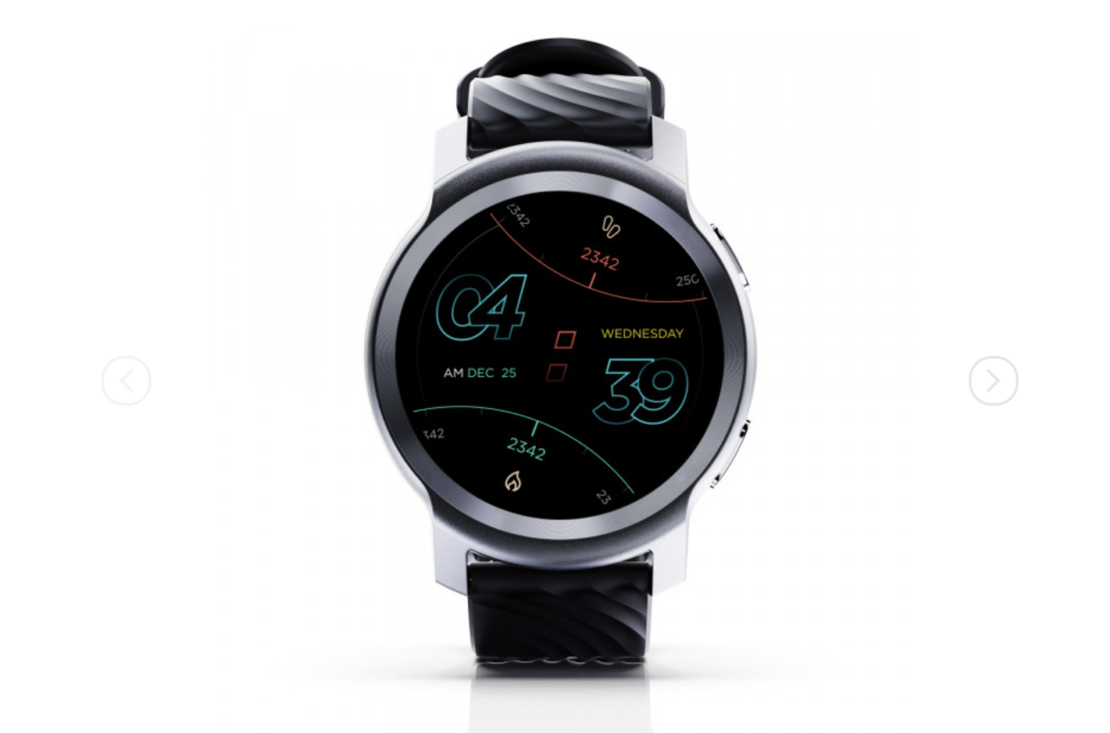
The Moto Watch 100 is available in Glacier Silver or Phantom Black for just$99.99. The hardware is clearly the best part of the watch experience with an aluminum watch case with curved edges, large side buttons, hard plastic back panel. The display is a COLOR LCD that is crisp and clear, but not that bright. The problem with the display is that swiping up and down through lists is painfully slow and laggy.
The black silicone strap is well made and comfortable for extended wear. The watch charges via a proprietary USB cable with a magnetic end that has two pins that connect with the back panel.
Also: Best fitness trackers: Improve your health and track your progress
Raise your wrist or press one of the buttons to turn on the display and show your selected watch face. There are seven watch faces available for you to select from buried down in the settings found on the watch, there is no syncing of watch faces from your smartphone either and the watch faces are not customizable.
Swipe down from the top to view the control center that shows quick controls such as silent mode toggle, alarm, settings, keep display on for five minutes, and find my phone. This display shows you the date and remaining battery life of the watch.
Pressing the top right button opens up the list of apps and utilities found on the watch. These include settings, activities, sleep, SpO2, heart rate, notifications, music, weather, flashlight, alarm, find my phone, shutter, timer, and stopwatch. There are no other available apps or widgets to install. Tapping one of these opens up the app and then shows you some other data or function.
Pressing the bottom right button takes you to a list of 26 activity options. There are no customizable displays for what is shown on the display while participating in one of these activities so it is a very restricted and limited experience, but there are quite a few sports and activities available to track and GPS is supported by the watch.
Swipe from left to right to go back one screen when you dive into an app or exercise option. From the watch face you swipe left or right to move through health summary of your day, music controls, weather, sleep, SpO2, and heart rate widgets.
In order to connect your Android phone and the Moto Watch 100 you must install the Moto Watch app. The website states that a version of the software is also coming to iOS in December 2021. There are four main tabs in the app; home, sleep, wellness, and activity. Tapping the icon in the top left corner takes you to the screen where you can manage the watch connection and your account. You are also supposed to be able to manage your profile, but making any changes here never get saved so don't bother with the profile settings.
On the home tab you can select from cards that are shown two wide down the display. Card options include sleep, steps, calories burned, active minutes, weight, heart rate, and SpO2. The selected cards show up with status charts for each data type you select. Below this your recent activities are shown on the home page. Tapping a card takes you into the card with more data, such as weekly and monthly views.
Also: Best smartwatch: Apple Watch and more top picks
The sleep tab shows your daily and weekly sleep scores, sleep goal, and your averages. At the bottom are your sleep schedule and a line for viewing your sleep log. When viewing your sleep log it just shows you the total hours slept for the past days and there is no capability to tap on that day and view the details of your sleep.
The wellness tab shows your heart rate, resting heart rate, high heart rate, and blood oxygen saturation level. There is also a line for your weight that you can log manually. Tapping on your heart rate will open up a view with today, weekly, and monthly plots.
The activity tab shows your activity, active calories, active minutes, and steps for the week or 7 week period. Scrolling down to the activity log shows your past activities and tapping these does indeed open up a screen with those details. The details show a GPS plot, duration, distance, and active calories, laps, average pace, total steps, and heart rate. For the runs I tested with the watch no steps or heart rate data was shown. The watch did OK with the GPS distance and calorie estimate, but it is not going to win any contest for GPS accuracy. The data also mixes up units from the universal selection so the experience is pretty broken.
Throughout the watch and smartphone app, there are misspelled words, wrong captalization, settings and options that cannot be enabled, and other settings that do not stay selected after navigating to another part of the app. There is a mixing of units even when one universal selection is made. The watch and smartphone software both need some work to be consistent and professional.
There is no rhyme or reason to the list of widgets, utilities, and options in the watch software so things are not even organized alphabetically. When you press the top button you see options such as activity log, sleep, heart rate, SpO2, and then notifications in that order. You cannot choose to reorder anything so finding something to do is a frustrating waste of time.
The smartphone app looks good at first with appealing colors and cards for the data with main tabs for home, sleep, wellness, and activity. However, you have very limited access to view past activities and data with no ability to create or export reports. You cannot export your data or share it with any other services so other than viewing something on the day you are activity, collecting the data is rather useless and not helpful for improving your health and fitness.
The OnePlus Watch is a much better option, but still not that great and priced$50 more. If you are looking for a fitness tracker that does a better job with tracking your data and providing you with the ability to use that data, then you should consider something like a Fitbit Luxe or Amazfit Band 5.
I will be returning mine shortly and so far the people responding to my return request at eBuyNow have been helpful and understanding regarding my request to return the watch. Despite a couple of firmware updates since it arrived, the watch software and smartphone app still need a lot of work for me to recommend this watch to anyone.
 Горячие метки:
Технологии и оборудование
Наш процесс
- с собой?
Часы Smart watch